Macgi
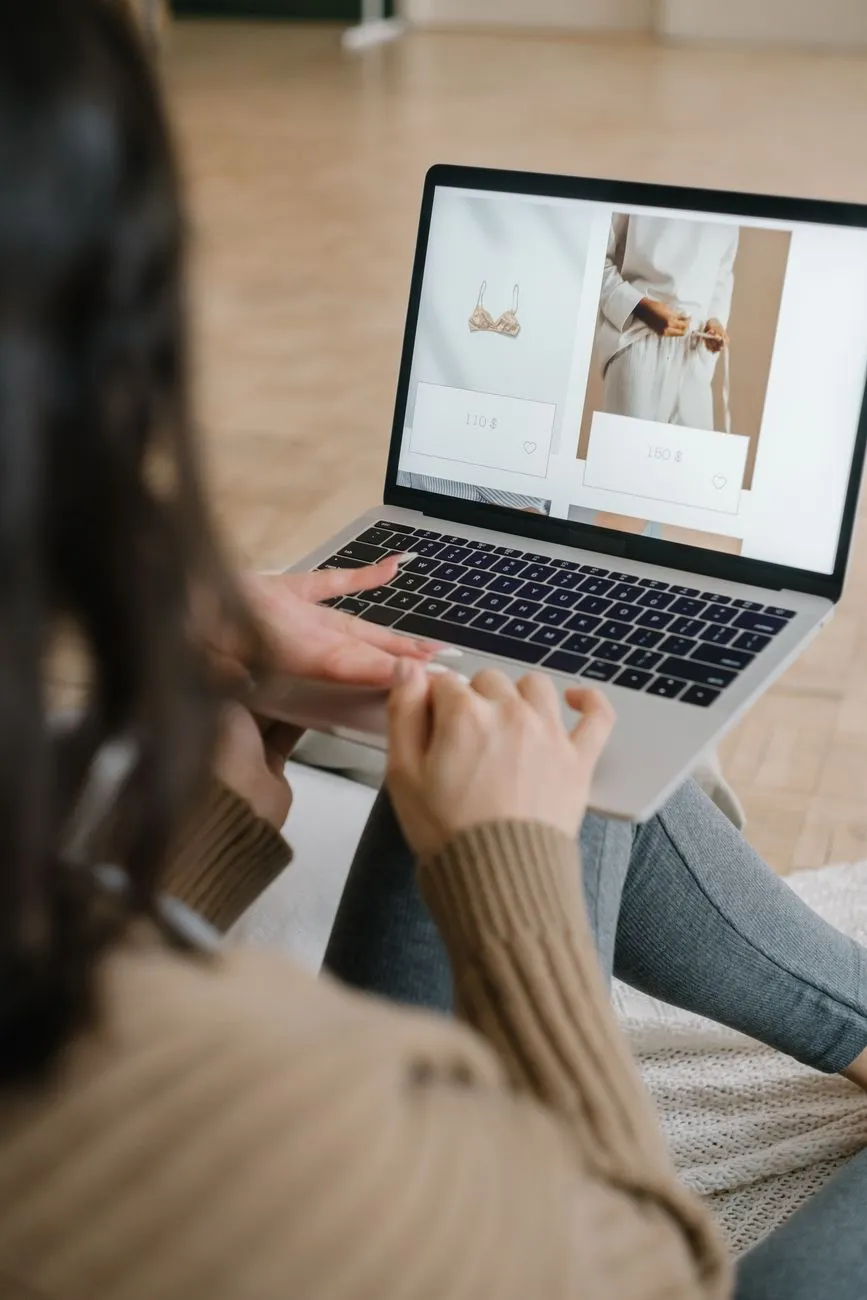
A strong fashion product page has to answer three questions quickly: What exactly am I buying? Will it fit me? What happens if it doesn’t work out? If any answer is missing or hard to find, shoppers usually leave or guess—and a wrong guess often becomes a return.
This checklist breaks the fashion product page into the areas that matter most: gallery, price and variants, size selection, fit notes, fabric and care, delivery and returns, reviews, and the mobile sticky add-to-cart.
1. Gallery: show the real garment from the angles shoppers need
Use the first image as the decision image
The main product image should show the front of the garment in a way that matches what the shopper will receive. For apparel, the safest first image is usually:
- Front view on a model or mannequin, or a clean flat lay
- True color without heavy filters
- No confusing crops, hangers, or props that hide the shape
- Visible hem, neckline, sleeve, or waistline if that detail matters
If you sell multiple colors, make the featured image match the selected color. A shopper who chooses “rust” should not keep seeing the black version at the top of the gallery.
Build the gallery in question order
Think of the gallery as a series of answers. Good order for a dress might be:
- Front
- Back
- Side or three-quarter view
- Close-up of fabric texture
- Close-up of closures, stitching, or lining
- On-model video if available
For trousers, add a close-up of the waistband and the hem. For a shirt, show the cuff and the collar. Avoid only showing one flat lay and one model photo; the shopper needs to understand drape and structure.
Keep image ratios consistent. If most images are 3:4, use 3:4 for all. This avoids a mobile gallery jumping between crops.
Platform checklist for the gallery
- Shopify: In the product admin, upload images in the Media section. In the theme editor, check how the product page displays thumbnails, zoom, and video. Use the featured image as the primary listing image.
- WooCommerce: In the product editor, set the Product image and Product gallery under Product data. Some themes override the gallery layout, so test the product page after changing themes.
- Haravan and Sapo: In the product editor, upload the main image and gallery images. If the theme does not show a clean gallery or zoom, adjust the product page template or ask the theme developer for a gallery block.
More on creating accurate product shots: How to photograph clothes to sell online: full checklist.
2. Price, variants, and availability should be impossible to miss
Show the price for the selected variant
Shoppers do not want to do math. If a dress costs $89 in solid colors but $94 in print, show that as soon as they choose the print. Avoid listing only “from $89” and leaving the shopper to discover the higher price at checkout.
For sale pricing, show the original price and the sale price in the same area. If you use “compare at” pricing on Shopify, make sure the original price still makes sense.
Make variant selection behave predictably
When a shopper chooses a size or color, the product image, price, and availability should update together. If a size is out of stock, disable it or show “notify me” instead of allowing the shopper to add it to cart.
Common variant errors to check:
- Selecting “M” does not change the image back to the default color
- Selecting “Blue” does not update the swatch or the photo
- Price changes but the size selector resets
- The Add to cart button stays active for unavailable combinations
Platform checklist for variants
- Shopify: Use product variants and set a compare-at price. In the theme customizer, test how variant pickers and price display on mobile.
- WooCommerce: Use a Variable Product. In Product data > Variations, set regular price and sale price per variation. Test the selector behavior on the live product page.
- Haravan and Sapo: In the product editor, set variant prices and stock. Preview the product page as a customer would see it, because some themes only update price but not the image.
For color-heavy catalogs, also review How to use color swatches on product pages to boost sales.
 Photo: Varfa / Pexels
3. Put the size chart link right next to the size selector
Why placement matters
A size chart hidden in a footer tab or shipping page does not help at the moment of decision. The link should sit directly next to or below the size buttons or size dropdown. Shoppers should not have to scroll upward or open a menu to find it.
The best wording is action-oriented and specific:
- “Size guide”
- “Find your size”
- “Size chart: bust, waist, hip”
- “Between sizes? Check the fit notes”
Avoid vague labels like “More info” or “Sizing details” if they are not immediately visible near the selector.
What the size chart should contain
A useful fashion size chart includes:
- Bust, waist, hip, and length in the unit your customers use
- Measurements for each size, not just S/M/L labels
- Whether measurements are body measurements or garment measurements
- How to measure: standing straight, over what clothing, at the fullest point
- Fit type: true to size, runs small, oversized, stretchy, or structured
If your product is a dress, link to a dress-specific chart rather than a generic one. You can create one using Dress Size Chart: Bust, Waist, Hip and Length by Style.
How to add the link on common platforms
- Shopify: In the theme customizer, look for the product page section or the variant picker block. If the theme supports custom text or a collapsible row, add a link there. Otherwise, use a theme block or Liquid code near the size selector.
- WooCommerce: Add the size chart as an extra tab using a plugin, or insert a short link above the Add to cart area with a small code snippet or widget. If you use product attributes for sizes, place the link in the short description.
- Haravan and Sapo: If the theme does not allow a link near the variant selector, add a clear “Size guide” button inside the product description just above the size options, or add a size chart image in the gallery and mention it in the product summary.
Also read How to Help Customers Choose the Right Size Online for Boutiques for a deeper fit-focused approach.
4. Fit notes, fabric, and care should answer what the photo cannot
Fit notes save time for shoppers and support teams
Use 2–4 short bullet points to describe how the garment fits. This is separate from the size chart; it is the human explanation of what the size chart means for this specific product.
Examples of useful fit notes:
- “Runs small through the bust. If you are between sizes, order one size up.”
- “True to size, but the waist has no stretch.”
- “Oversized cut. Model wears size S but usually wears M.”
- “Inseam length is 68 cm in all sizes; size affects waist and hip only.”
Bad wording:
- “Fits everyone.”
- “Model is 170 cm.”
- “Refer to size chart.”
The last one is not a fit note. The shopper needs context.
Fabric and care should be near the buy button, not only on the label
Shoppers want to know:
- Main fabric and lining fabric
- Stretch level
- Weight and transparency
- Care: machine wash, hand wash, dry clean, ironing
- Whether the fabric shrinks or fades
Put this in a collapsible section or an easy-to-scan list on the product page. Do not hide it only as a photo of the care label; many mobile shoppers cannot read that clearly.
Example format:
Fabric: 95% cotton, 5% elastane
Stretch: Medium
Lining: Unlined
Care: Machine wash cold, hang dry
 Photo: Michael Burrows / Pexels
5. Delivery, returns, and reviews belong near the buy box
Delivery and returns reduce hesitation
The shopper should not have to visit a separate policy page to learn:
- How long order processing takes
- Shipping time and cost
- Whether returns or exchanges are allowed
- Who pays return shipping
- How many days the return window is
Place a 2–3 line summary under the Add to cart button or in a collapsible tab directly below it. For example:
“Ships in 1–2 business days. 14-day return window. Return shipping paid by customer unless the item is faulty.”
Check your current return policy wording against the actual rules in your country. Consumer-protection rules and platform fee structures change, so check the current official source for your market before publishing specific promises.
Reviews should answer fit and fabric questions
Reviews are more helpful when they mention:
- The reviewer’s usual size and the size they bought
- Height or body shape if the reviewer chose to share it
- Whether the item ran small, large, or true to size
- Fabric feel after wearing and washing
- Real photos of the item, not only the box
If your review app allows filters, show fit-related reviews first. A shopper who is 160 cm tall and usually wears M will look for a review from someone similar.
Platform notes: WooCommerce has built-in product reviews. Shopify stores typically use a review app. Haravan and Sapo stores can add review platforms or widgets; choose one that shows review photos and size information.
6. Sticky add-to-cart on mobile is about access, not pressure
What to include
A sticky add-to-cart bar on mobile should let the shopper act without scrolling back to the top. A good sticky bar includes:
- A small product thumbnail
- Product title or short name
- Selected price
- A compact size selector, if possible
- Add to cart or Buy now button
Avoid a sticky bar that only shows “Add to cart” and hides the price. That creates doubt. If the bar covers the size selector, make sure the shopper can still choose size before tapping Add to cart.
When to use it
Use the sticky bar on product pages where the product name, gallery, size chart, and fit notes take up a long mobile page. It is less useful on a very short page where the Add to cart button is already visible.
Platform notes
- Shopify: Some themes include a sticky add-to-cart option in the theme customizer. If not, use a sticky add-to-cart app or a custom Liquid snippet.
- WooCommerce: Several plugins add a sticky bar. If you use a page builder, you can create one in the product template.
- Haravan and Sapo: Many fashion themes include this feature. If yours does not, a developer can add a fixed bar via theme code.
Always test the sticky bar on small phones. It should not cover the size chart link, the variant selector, or the product photo for too long.
7. Product page audit checklist
Run this before a campaign or a seasonal restock:
- First product image shows the selected color and front view
- Gallery includes back, side, fabric, and detail shots
- Price updates with the selected variant
- Unavailable variants are disabled
- Size chart link sits next to the size selector
- Fit notes explain whether the item runs small or large
- Fabric and care details are readable on mobile
- Delivery and returns summary is above the fold or one tap away
- Reviews show fit information and real photos
- Mobile sticky add-to-cart shows price and respects the size selector
One way to close the gap between seeing a garment and feeling confident is a virtual try-on button next to Add to cart. Macgi’s widget uses your existing product photos and lets a shopper upload a full-body photo to see herself wearing the item in 15–40 seconds. If you want to test it on your product pages, sign up for the Macgi free beta.
FAQ
How many product images should a fashion product page have?
Aim for at least five: front, back, side or detail, fabric, and one on-model or lifestyle shot. The exact number depends on the garment, but don’t pad the gallery with near-duplicates.
Should I put the size chart in the product description or as a link next to the size selector?
Put the link next to the size selector. A size chart inside the long description may be missed, especially on mobile. The chart can open as a popup, tab, or separate page.
What if my theme does not support a link next to the size selector?
Check the theme settings first. On Shopify, use a custom block or Liquid. On WooCommerce, use a hook or a plugin. On Haravan or Sapo, you can add the link in the product description above the selector or ask a developer to modify the template.
How long should the fit notes section be?
Keep it to 2–4 bullet points. Focus on whether the item runs small, large, or true to size, and mention stretch, length, or areas that often cause fit issues.
Does a sticky add-to-cart button always improve conversions?
Not automatically. It helps when the product page is long and the buyer needs quick access to the button. It can hurt if it covers the size selector, price, or size chart. Test it on a real phone.