Macgi
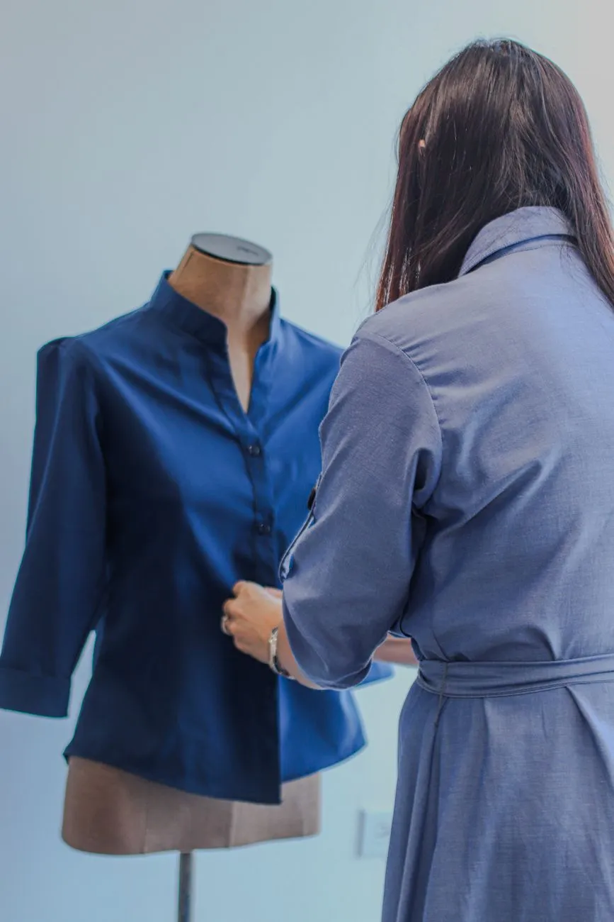
For a clothing collection to feel intentional, the photography needs two things at once: enough consistency for the product pages and enough storytelling for social posts. A shopper should see the same navy dress on the product page, in the collection banner and in an Instagram carousel without feeling like the color or fit changed.
The easiest way to get that result is to plan collection photography as one system, not as separate “catalog photos” and “content photos.” The shots below give you the main building blocks: product-page consistency, lifestyle scenes, seasonal sets, detail images, moodboards and a shot list that holds it all together.
Build a shot list before you shoot
A shot list turns a vague “let’s photograph the new collection” into a repeatable shoot. It helps you avoid missing the back view, the close-up of the buttons, or the one outfit you need for the collection banner.
For each product, write down:
- Product name or SKU
- Colorway
- Shot type: front, side, back, detail, lifestyle, flat lay, ghost mannequin, model
- Camera angle: eye level, waist level, top down, low angle
- Background: white, warm gray, studio wall, outdoor scene
- Props: bag, chair, flowers, book, coffee cup
- Model pose: standing straight, walking, sitting, reaching
- Lighting direction: window left, window right, soft daylight, studio light
- File name: brand-date-style-color-shot-number, for example
linen-dress-oat-front-01 - Product page position: main image, second image, hover image, third image, social only
A short shot list for one linen dress might look like this:
- Front on hanger, warm white background, soft daylight, main product image
- Front ghost mannequin, same background, second image
- Back view, same background, third image
- Fabric close-up showing weave and weight, fourth image
- Side seam and hem close-up, fifth image
- Full-body model seated on a wooden stool, window light, collection page and social
- Vertical 4:5 crop of the model shot for Instagram
For example, a 12-piece collection with five product-page images per style is already 60 base images. Add 20 detail shots and 10 social crops, and the shoot becomes much easier to estimate. The shot list also stops you from over-shooting one product and running out of time for another.
Keep product-page images consistent first
Product-page images are the reference for the whole collection. The most common trust-breaker is a collection page where one dress is on a model, the next is hanging, the next has a yellow background and the next is a supplier photo with different lighting.
Pick one system for the main product image and stick with it across the collection.
Useful systems for clothing product pages:
- Ghost mannequin front view on light gray
- Hanging garment on white
- Flat lay on neutral fabric
- Full-body model standing straight with a simple wall background
- On-model front view with the same model, same crop and same distance for every style
Once the main image is chosen, build the gallery in the same order for each product. A reliable order might be:
- Main front image
- Back view
- Side or 45-degree view
- Fabric or texture close-up
- Detail of closure, hem or cuff
- Lifestyle image or on-body motion shot
In Shopify, this means uploading all images to the product media section, setting the main image first, and adding alt text for each image. In WooCommerce, use the product gallery and set the featured image in the product data. Haravan and Sapo have similar product image galleries. The platform matters less than keeping the same image order and background language for every product in the collection.
If you use supplier images, edit them to match before uploading. This can be as simple as replacing the background, cropping to the same ratio and correcting the white balance. Start with a full checklist if you need to audit your catalog: How to photograph clothes to sell online: full checklist. If you are shooting in a small space, Clothing Product Photography Setup: Small Home Studio on a Budget shows a simple layout that still looks consistent.
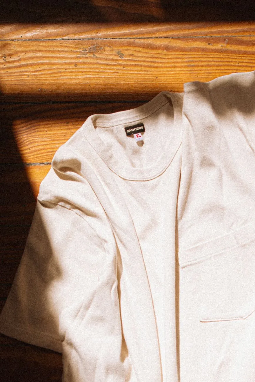 Photo: Daniel & Hannah Snipes / Pexels
Lifestyle scenes that make the collection feel wearable
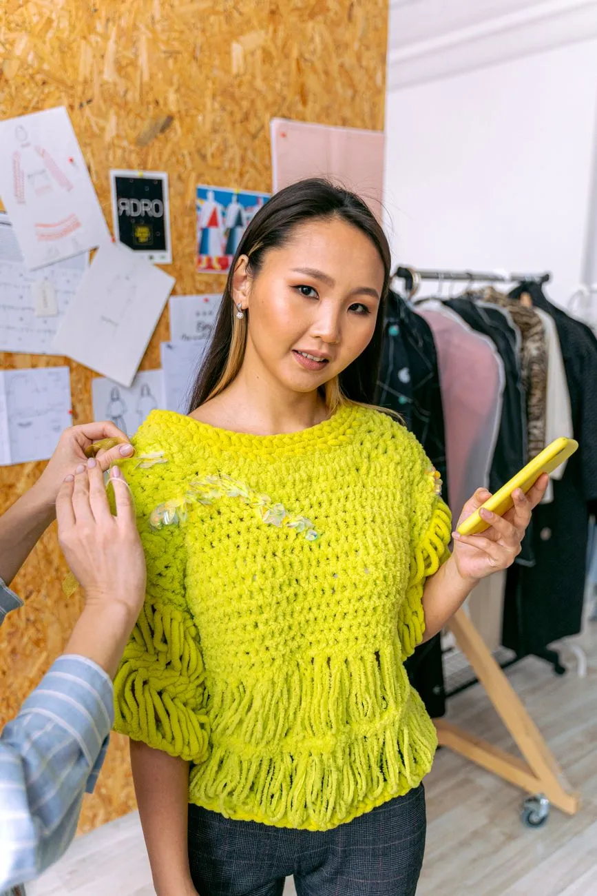
Lifestyle photography shows the garment in a real moment: a coat being thrown over a chair, a dress worn while walking to the door, a knit top with a coffee cup and a book. These images work well on the collection page, in email banners, on Instagram and in ads.
The risk is that lifestyle shots become too random. A collection looks stronger when the scenes repeat. Create three or four scene templates and use them across the whole drop:
- Table or café scene: model seated, product shown from the waist up, natural window light
- Doorway or street scene: full-body model stepping out, bag or keys in hand
- Home scene: model reaching for a shelf, sitting on a bench, or adjusting a sleeve
- Motion scene: walking, crossing a street, turning to show the back
For each outfit, shoot one full-body lifestyle image and one waist-up or motion image. The full-body shot gives the outfit context; the tighter shot gives the fabric and neckline more presence.
Keep the product visible. A beautiful photo where the model’s hair covers the neckline or the bag covers the waistband is not useful for selling the garment. The clothes should be the reason the image exists, not a prop in a moody portrait.
When writing captions for these images, describe the fit and fabric, not just the mood. Compare:
- Weak: “Cute look for the weekend.”
- Strong: “Oversized linen shirt, model is 168 cm and wears size M. The fabric is pre-washed and has a soft drape.”
The second caption gives the shopper something to compare against their own body and expectations.
Seasonal sets and campaign visuals
Seasonal sets give the collection a clear story without changing the product-page standards. You can use seasonal styling for the collection page banner, social posts, email headers and paid ads while keeping the product gallery consistent.
Seasonal ideas that work for small shops:
- Spring: greenhouse or balcony, white wooden bench, soft daylight, light layers, one bunch of fresh flowers
- Summer: terrace or poolside wall, linen textures, sunglasses, wet-look hair, bare legs or simple sandals
- Autumn: bookshop corner, wood tones, knitted props, warm lamp light, coat thrown over a bag
- Winter: café window, dark wall, cashmere wrap, cup with steam, boots at the door
A practical small-budget setup is to keep one reusable surface, wall or corner and change only the props and accessories. For example, the same beige wall can be a spring set with a rattan chair and flowers, then a winter set with a dark coat rack and boots.
Keep seasonal images away from the main product gallery if the props distract from the garment. Use them as secondary images, collection banners or social content. The product page should still answer “what does this item look like?” while the seasonal image answers “how would I style this?”
Detail and texture shots that answer customer questions
Detail shots are one of the most underused parts of collection photography. A shopper who cannot touch the fabric needs visual proof of weight, texture, transparency and construction.
For every garment in the collection, try to capture at least three of these:
- Fabric close-up showing weave, knit, pile or sheen
- Buttons, zip, hooks or ties
- Collar, cuffs, hem, waistband or drawstring
- Lining or inside seam if it affects comfort or fit
- Print placement and repeat, especially for floral or patterned pieces
- Stretch or drape shown by holding the fabric between fingers
Use window light or a soft studio light and a macro lens or a phone with macro mode. Place the camera parallel to the fabric so the texture reads clearly. A close-up of a knit sweater should look like you can feel it; a satin dress should show the way the light moves.
These images do not need to be beautiful campaign shots. They need to be honest and sharp. Put them in the product gallery after the front and back views. They help answer questions like “is the shirt sheer?” and “is the zip hidden?” before the shopper asks customer service.
For flat-lay detail shots, Flat Lay Clothing Photography: Surfaces, Light, and Styling Tips goes deeper into simple styling that keeps the garment readable.
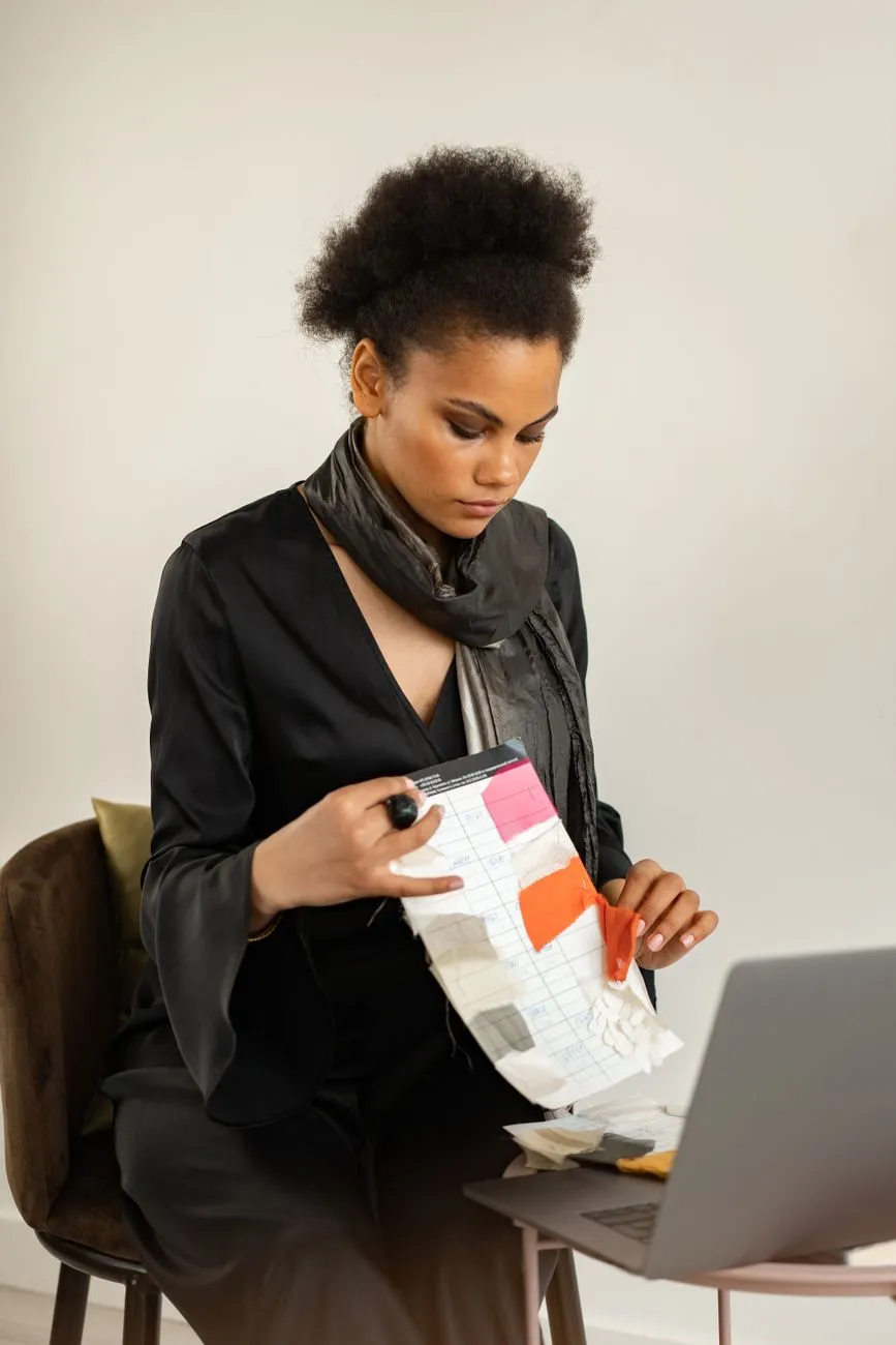 Photo: Mikhail Nilov / Pexels
Moodboards to guide styling and editing
A moodboard is not just for big brands. It keeps the model, stylist, photographer and shop owner aligned before the shoot day.
Make two separate boards:
- Product accuracy board: colors, backgrounds, crops, lighting and gallery order. This is the contract for the product pages.
- Campaign mood board: scene references, props, model poses, makeup and social formats. This is the contract for the collection story.
A simple product accuracy board might have three images: the approved background, the approved front crop and the approved fabric close-up. A campaign board might have a color palette of oat, ink and terracotta, plus two photo references for a café scene and a doorway scene.
Translate the moodboard into the shot list. If the board says “window light from the left, model seated on a wooden stool, linen background,” the shot list should repeat that exact instruction for every look. This prevents the common problem of a collection that looks great in the first three products and slowly drifts into different lighting and poses by the end of the shoot.
Social-first crops, captions and short video ideas
Collection images can do more than fill an Instagram grid. Plan social crops and short video clips during the same shoot so you do not have to recreate moments later.
Useful crops and formats:
- 1:1 for the main feed
- 4:5 for Instagram and Facebook carousels
- 9:16 for Reels, Stories and TikTok
- 3:4 for collection page banners on some themes
For a three-image carousel, a strong sequence is:
- Full-body outfit on a simple background
- Fabric or detail close-up
- Lifestyle scene with the same garment
For short videos, capture:
- Model walking toward camera and turning once
- Hands opening a jacket or showing a hidden zip
- Fabric draped and released to show movement
- Changing from one colorway to another in the same pose
- Flat lay being built with accessories
Keep the product the focus. Social filters that change skin tone or add heavy color grading can also change the garment color. If the shopper sees a warm golden dress on Instagram and a beige dress on the product page, that mismatch creates doubt.
For more short product video ideas, see Fashion Product Video: 10–20 Second Formats for Product Pages.
Common mistakes that break collection trust
Most collection photography mistakes come from rushing the product images or over-styling the social images.
Watch out for:
- Mixing white, gray and lifestyle backgrounds in the main product gallery
- Different models for the same style or colorway
- Heavy filters that shift the garment color
- Props that cover the neckline, waistband or hem
- Cropping out feet, sleeves or the back view
- Shooting only the front view and one detail shot
- Using supplier images without matching the color and crop
- Shooting in strong colored light that makes white shirts look blue
- Changing the gallery order between products
A quick check before uploading is to view the collection as a grid. If the first impression is backgrounds, lighting or prop differences rather than the clothes themselves, the collection photography needs more rules.
The goal is not to make every image identical. It is to make the differences feel intentional: the product pages stay clean and comparable, while the social images tell the story.
If a shopper is still unsure how a garment will sit on their body, a virtual try-on button next to “Add to cart” lets them judge the look before buying. Macgi’s widget uses your existing product photos and fits into the product page without a full photography reshoot; the free beta includes 1,000 try-ons. Try Macgi’s free beta.
FAQ
How many photos do I need per product for a collection?
A practical minimum is five to eight images for the product page: front, back, side or 45-degree view, fabric detail, closure detail, and one or two lifestyle or styled images. You can add social-only images without placing them in the product gallery.
Should I use the same model for the whole collection?
Yes, especially for the main product images. Using the same model helps shoppers compare fit across styles. If you cannot use the same model, keep the pose, crop, background and camera distance as similar as possible.
Can I shoot a collection on a phone?
Yes, if you control the light and background. Use window light or a soft artificial light, clean the lens, lock exposure before shooting and avoid heavy filters. The key is consistency: choose one location and one editing preset for the whole collection.
How do I keep product-page images consistent over multiple shooting days?
Keep a reference image next to the camera and compare each new shot to it. Use the same background, same camera height, same lens or phone setting, and the same edit. Save a preset or simple edit recipe: white balance, brightness, contrast, slight sharpen, no color shift.