Macgi

Color is one of the few things a shopper can evaluate from a product photo alone, but only if the page makes the choice visible. When a store uses a plain dropdown like “Colour: Black” or “Size: M”, the shopper has to read options one by one. Swatches turn that into a scan: the eye finds the green, the stripe, the oat tone, and the buyer can tap it without opening an extra menu.
For fashion stores, swatches are not just a design upgrade. They reduce friction between the product image and the variant selection, make product pages feel more like a real rack of clothes, and help shoppers understand the difference between “Sand” and “Beige” before checkout. This is especially useful for stores that sell the same dress in five colours, or the same shirt in sizes XS to XXL.
Why swatches beat dropdowns for colour and size
A dropdown hides most of the options until the shopper opens it. A swatch row shows every option at once. That matters in online clothing because colour and size are often the two decisions that lead to a return if the shopper chooses wrong.
Imagine a product page for a linen shirt with eight colour options. With a dropdown, the shopper sees “Colour” and has to click to reveal the list. With swatches, the shopper sees eight small colour squares next to the product photo. The visual memory of the product stays active while they compare. If they want the sage green, they tap it and the product gallery updates.
Size swatches work on the same principle, but instead of colour squares they usually appear as small labels: XS, S, M, L, XL. This is better than a dropdown because size is not just a letter; it is a decision about body fit. A visible size row lets the shopper see the full size range immediately and makes sold-out sizes obvious without a click.
There is also a practical conversion benefit. Every extra click or menu interaction is a chance for the shopper to lose focus, second-guess the item, or open a competitor’s tab. A swatch row removes that step.
A good way to think about it: dropdowns are fine for technical options such as “Length” or “Package type”. For anything the shopper can see or feel, show it visually. Colour and size are both visual enough to deserve swatches.
Swatch images vs flat colour swatches: when to use which
There are two common ways to build a colour swatch: a flat CSS colour block, or a small image of the actual fabric or garment. Each has a place.
Flat colour swatches
Flat colour swatches are simple squares or circles filled with a hex code, such as #C4A882 for oat or #2F3E46 for petrol. They work best for solid-colour basics: plain T-shirts, leggings, knitwear, tank tops, or any product where the colour is uniform and the fabric texture does not change much between colours.
Flat swatches load quickly, are easy to maintain, and look clean. However, a flat block of red does not always match the real red on screen. Screens vary by brightness and colour profile, so a shopper may see cherry red on their phone while the garment is more of a brick red. This is why many stores pair flat swatches with the product photo changing on selection.
Image swatches
Image swatches use a small photo of the actual fabric, print, or product in that colour. They are the better choice for:
- patterns such as floral, stripe, plaid, or leopard;
- multicolour items where a single hex code would be misleading;
- textured fabrics such as boucle, corduroy, ribbed knits, or washed linen;
- colourways that include different contrast stitching, trims, or buttons.
An image swatch shows the fabric or print up close, so the shopper sees not just “blue” but “blue with thin white pinstripes”. That reduces the number of “the colour looks different in person” returns.
The trade-off is maintenance. You need a small image for every colour, and those images should be colour-accurate. A photo of the fabric taken in warm light can make a cream colour look yellow. Use the same lighting and background for all swatch images.
Hybrid approach
Many stores use flat swatches for solid colours and image swatches for prints. On a product page for a dress sold in black, white, and floral, the black and white swatches can be flat colour blocks, while the floral swatch is a small image of the print. This keeps the row easy to scan and uses the more informative swatch only where it is needed.
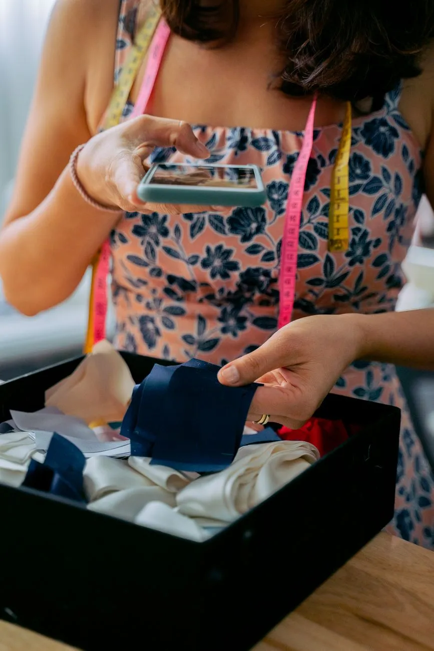 Photo: Anna Tarazevich / Pexels
How to set up colour swatches on Shopify
The exact steps depend on whether your Shopify theme has built-in swatch support. Some themes include colour swatches as a theme setting. Others require a product options app or a small code change.
Step 1: Check your theme editor first
Open your Shopify admin, go to the theme editor for your live theme, and open the product page template. Look for a section or block related to “Product information”, “Variant picker”, or “Buy buttons”. If you see a setting called “Enable colour swatches”, “Show variant swatches”, or similar, switch it on and choose whether to use flat colours or images.
Some themes ask you to map an option name such as “Color” or “Colour” to a display style. If your product options are named “Color”, make sure the theme is set to render that option as swatches, not as a dropdown.
Step 2: Use the product option name consistently
Swatch features usually look for a specific option name. If one product uses “Color”, another uses “Colour”, and a third uses “Màu”, then only some products will get swatches. Pick one naming convention and apply it across the catalog.
In your product variant settings, make sure the colour option is present for every relevant variant. For example, if you sell a shirt in Black, White, and Sage, create variants with those exact values and attach the correct product image to each variant. The swatch will then update the main photo when clicked.
Step 3: Add a swatch app if the theme does not support it
If your theme has no built-in swatches, search the Shopify App Store for terms like “product options”, “variant swatches”, or “colour swatches”. Choose an app that can:
- replace a chosen option with swatch buttons;
- use both flat colours and swatch images;
- show a tooltip with the colour name;
- mark sold-out variants as disabled or crossed out.
Install the app and follow its setup wizard. Most swatch apps ask you to choose which option name should become swatches, then assign a colour or image to each option value. Test on one product before enabling for the whole store.
Step 4: Attach variant images
Whether you use a theme feature or an app, the largest usability win comes from variant images. In the product editor, open each variant and attach the photo that shows the product in that exact colour. Then when a shopper taps the red swatch, the main image changes to the red product. If the variant image does not change, the swatch row still works, but the page feels static and the shopper has to scroll through the gallery manually.
 Photo: Michael Burrows / Pexels
How to set up colour swatches on WooCommerce
WooCommerce stores usually handle variable products through the built-in attribute and variation system. To get swatches, most stores add a dedicated plugin because the default WooCommerce variation selector is a dropdown.
Step 1: Create colour attributes properly
In the WordPress admin, go to Products and edit a variable product. Under Product data, choose Variable product. Go to the Attributes tab and add an attribute called “Color” or “Colour”. Use consistent slugs and values, such as black, white, sage. If you want to reuse colours across products, create them as global attributes under Products > Attributes, then assign them to each product.
Next, go to the Variations tab and create variations for each colour. Add a product image to each variation. This step is easy to skip, but it is what makes the swatch update the main image when clicked.
Step 2: Install a variation swatches plugin
WooCommerce does not ship colour swatches by default. Install a plugin from the WordPress plugin directory or a commercial plugin that adds “Variation Swatches for WooCommerce”. Look for a plugin that offers:
- colour swatches and image swatches;
- label swatches for sizes;
- tooltip support;
- the ability to hide unavailable variations.
After activating the plugin, go to its settings page. Most plugins add a new tab under Product data or under Appearance > Customize. Choose “Color” as the attribute to display as swatches, then assign a colour code or swatch image for each attribute term.
Step 3: Set size as a label swatch
For size, use the same attribute logic but choose “Label” or “Text” as the display type. This produces buttons such as XS, S, M, L, XL instead of a dropdown. Mark out-of-stock sizes with a disabled style or a line through the label so shoppers can see at a glance what is not available.
Step 4: Test on desktop and mobile
Create a test product with three colours and four sizes. View it while logged out, select each colour, and confirm the main image changes. On a mobile browser, check that the swatches are large enough to tap without zooming. Buttons that are too small cause more mistakes than a dropdown.
How to set up swatches on Haravan and Sapo
Haravan and Sapo are popular among Vietnamese online fashion shops, and both allow you to customise the product page using the theme editor and custom code. The principle is the same as on Shopify or WooCommerce: keep a consistent option name, assign values, then replace the dropdown with swatch buttons.
Haravan
In the Haravan admin, open a product and check how its product variants or attributes are named. Many Haravan themes already have a built-in colour or size picker style in the theme editor. Go to the theme settings for the product page and look for options like “Kiểu chọn thuộc tính”, “Màu sắc”, or “Kích thước”. If the theme supports swatches, enable them and assign a colour image or hex code to each colour value.
If the theme does not support swatches, you can add a small JavaScript snippet to the product template. A developer or a theme customisation service can replace the <select> dropdown for the colour attribute with a row of buttons using the same option values. The buttons should trigger the same change event as the dropdown so the selected variant is still added to the cart correctly.
Sapo
In Sapo, the process is similar. Open the theme editor for your product page and search for “biến thể”, “màu sắc”, or “thuộc tính”. Some Sapo themes include a swatch option for colour or size. If not, you can use the platform’s custom HTML/JavaScript capability in the product page template.
For both Haravan and Sapo, the most common mistake is changing the visual swatch without keeping the underlying variant values. If the original dropdown value is “Đen” but your swatch button uses “Black”, the page may show the wrong variant when added to cart. Keep the display label separate from the option value, or use the exact value text in the button’s data attribute.
After adding swatches, test a full purchase on a real mobile phone. Go to a product with three colours and three sizes, select each combination, and make sure the cart receives the correct variant name.
Making swatches accessible and usable on mobile
Swatches are only a sales improvement if everyone can use them, including shoppers with low vision, colour blindness, or motor difficulties.
Give every swatch a text label or tooltip
Do not rely on colour alone. A red square and a green square may look identical to a colour-blind shopper. Show the colour name on hover or tap: “Brick Red”, “Forest Green”, “Oat Beige”. For size swatches, the label is already text, so this is usually not an issue.
Use a minimum touch target
On mobile, tap targets should be at least about 44–48 pixels square. If your theme renders 24-pixel swatches with no gap between them, shoppers will tap the wrong colour. Increase the size, add spacing, and consider showing the selected swatch with a clear border or checkmark.
Communicate state without colour alone
A selected swatch should not just turn blue or change background colour. Add a border, underline, checkmark, or the word “Selected” so the state is obvious. For sold-out sizes, use a diagonal line or reduced opacity, but keep the text readable. Avoid using red text alone to mean “sold out”.
Keyboard and screen reader support
If you are comfortable with code, each swatch button should be a <button> element with an aria-label or visible text. Use aria-pressed="true" for the selected option. When a shopper presses Tab, the focus should move through the swatches in order, and Enter or Space should select the option.
This is usually built into well-maintained swatch apps and newer themes. If you are adding custom swatches, ask your developer to test with keyboard navigation and a screen reader such as NVDA or VoiceOver.
What to measure after you add swatches
You do not need a large data set to see whether swatches are helping. Start with a simple before-and-after check.
Useful metrics
- Product page conversion rate: orders divided by product page views, per product or per collection.
- Add-to-cart rate: how many product page views result in an add to cart.
- Variant selection rate: in tools such as Google Analytics or your platform’s reports, check how many sessions interact with the variant selector.
- Return reason tags: if you tag returns by reason, watch whether “colour not as expected” or “wrong size selected” changes after the swatch update.
- Mobile vs desktop add-to-cart rate: swatches often help mobile shoppers most, because dropdowns are especially awkward on small screens.
Worked example
For example, if a dress product page had 1,000 visits in the month before swatches and 60 add-to-carts, the add-to-cart rate was 6%. After adding image swatches and variant photos, if the same page has 1,000 visits and 78 add-to-carts, that is 7.8%. That difference may not prove anything by itself, but if it holds across several products and months, it is a useful signal.
Watch for mistakes
A drop in add-to-cart rate after adding swatches usually means something is broken: the swatch is not updating the variant, the selected combination is invalid, or the swatch is too small on mobile. Test a full order yourself before drawing conclusions.
Common mistakes that hurt swatch performance
-
Using a dropdown for size while using swatches for colour. If colour is visual and size is visual, show both as swatches. A mixed row of colour squares and a dropdown for size still creates extra clicks for the second most important decision.
-
Not attaching variant images. A beautiful swatch row that does not change the main product photo wastes most of the benefit. The shopper has to imagine what “Chocolate Brown” looks like on the actual product.
-
Using mismatched or low-quality swatch images. If the black swatch looks dark grey and the white swatch looks pale yellow, shoppers will lose trust. Shoot all fabric swatches under the same light, or use a fixed colour chart.
-
Creating dozens of tiny swatches. Eight colours on mobile can become a wall of dots. Group similar colours or use a horizontal scroll, but make each swatch large enough to read.
-
Hiding the colour name. The tooltip or label is not just for accessibility; it also helps shoppers share the product with a friend or ask a question. “It’s the moss green one” is more useful than “the third dot from the left”.
-
Ignoring sold-out states. If a size is unavailable, show it as unavailable. Letting a shopper click a size only to see an error after trying to add to cart creates frustration.
-
Not testing on a real phone. A swatch row can look perfect on desktop and become unusable on mobile. Test with one hand, on a small screen, in daylight.
Macgi try-on button: one more way to reduce colour and fit doubt
Even with great swatches, a shopper can still wonder how a colour will look on their own skin tone, body shape, and height. A virtual try-on button next to “Add to cart” lets shoppers upload one full-body photo and see themselves wearing the product in about 15–40 seconds. You do not need new model photos or a separate app: it uses the product images you already have. Macgi’s widget is currently in a free beta for 1,000 try-ons and works on Shopify, WooCommerce, Haravan, Sapo, or any site where you can add HTML. Try Macgi in the free beta.
FAQ
Do swatches work for size as well as colour?
Yes. Size swatches are usually text buttons such as XS, S, M, L, XL. They make the full size range visible at once and help shoppers see missing sizes without opening a dropdown.
Should I use flat colour swatches or image swatches?
Use flat colour blocks for solid, uniform colours. Use image swatches for prints, patterns, multicolour items, or textured fabrics. Many stores use a hybrid: flat swatches for basic colours and image swatches for patterned options.
Do I need a special app to add swatches on Shopify?
Not always. Some themes include swatches as a built-in setting. If your theme does not, you can use a product options or variant swatches app from the Shopify App Store.
Can I add swatches to Haravan and Sapo if my theme does not support them?
Usually yes. Both platforms allow theme customisation, and a developer or theme service can replace the variant dropdown with swatch buttons. The key is to keep the original option values so the correct variant is added to the cart.
What is the most common reason swatches hurt conversion?
The most common reason is that the swatch does not update the main product image or passes the wrong variant to the cart. Always test a real purchase after making changes.