Macgi
Color matching clothes to skin tone is less about finding one “correct” colour and more about making your skin look clearer, your eyes look brighter, and your outfit look intentional. The biggest mistake is judging only by the surface colour of your skin—light, tan, medium, deep—when what really changes how a shirt flatters you is your undertone: the subtle hue sitting underneath the skin’s surface.
This guide covers undertone tests you can do at home, warm/cool/neutral palettes, the basics of seasonal colour analysis, and specific advice for tan and darker Asian skin tones.
Why undertone matters more than surface tone
Your surface skin tone can change with sun exposure, lighting, or tanning. Your undertone stays the same. It is the reason the same mustard shirt can make one person look fresh and another look tired, even if they have a similar depth of skin colour.
Undertones usually fall into three groups:
- Warm: the skin has yellow, golden, peachy, or olive hints.
- Cool: the skin has pink, red, blue, or rosy hints.
- Neutral: a mix of warm and cool, or no obvious leaning.
Once you know your undertone, you can narrow down colours instead of guessing from every rack. The goal is not to ban colours, but to choose shades that work near your face and to place trickier colours lower down if you still love them.
Three undertone tests you can do at home
You do not need a professional colour analysis to get a useful answer. Do these in natural daylight, with no makeup on, and look at the overall effect rather than one small patch of skin.
1. The vein test
Look at the veins on the inside of your wrist.
- Veins that look green or olive usually suggest a warm undertone.
- Veins that look blue or purple usually suggest a cool undertone.
- Veins that are hard to classify, or look blue-green, often mean neutral.
This test is a starting point, not a final verdict. It can be less clear on deeper skin tones, so use it with the next tests.
2. The white paper or white fabric test
Hold a plain white piece of paper, a white towel, or a white T-shirt next to your face in natural light. Compare your skin against that pure white.
- If your skin looks yellowish, golden, or olive next to the white, you are likely warm.
- If your skin looks pink, rosy, or slightly red, you are likely cool.
- If your skin looks greyish, dull, or simply neutral, you may be neutral.
You can also compare pure white with off-white or cream. Warm undertones often look more alive in cream or ivory, while cool undertones often handle crisp pure white better.
3. The gold and silver test
Hold a piece of gold-toned jewellery and a piece of silver-toned jewellery near your face.
- If gold makes your skin look healthier and more even, you lean warm.
- If silver makes your skin look clearer and brighter, you lean cool.
- If both look fine, you are probably neutral.
If the tests conflict, do not overthink it. The test where you see the biggest difference is usually the most useful one.
A practical way to compare colours is to take a full-body photo in daylight and test different tops against your skin. Macgi can help with this: upload one full-body photo or take one on your phone, try a top, a top with trousers, or a dress, and get a result in about 15–40 seconds. The AI keeps your face, body shape, skin tone, pose and background and changes only the clothes, so you can compare colours on yourself without needing a changing room. The photo is only used for your own try-on images, and the temporary copy sent to the AI is deleted within 24 hours.
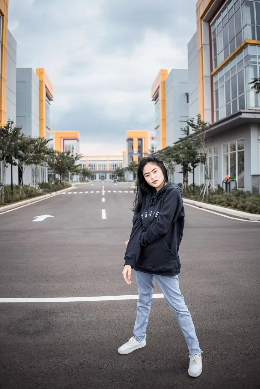 Photo: Agung Pratama / Pexels
Warm, cool and neutral: what each palette looks like
These palettes are not strict rules. They are starting points for colours that tend to flatter each undertone.
Warm undertone palette
If you have a warm undertone, look for colours with golden, yellow, or earthy bases.
Good near the face:
- Cream, ivory, off-white
- Camel, tan, caramel, chocolate brown
- Olive, moss, warm khaki
- Mustard, golden yellow
- Tomato red, brick, rust, terracotta
- Peach, coral, warm salmon
- Teal, peacock, warm turquoise
Trickier near the face:
- Icy pastels, especially baby blue and lavender
- Fuchsia and blue-based pinks
- Cool grey with no warmth
- Pure optic white
Those trickier colours can still work as trousers, skirts, or accessories, simply away from the face.
Cool undertone palette
If you have a cool undertone, look for colours with blue, pink, or rosy bases.
Good near the face:
- Pure white, cool grey, charcoal
- Navy, royal blue, sapphire
- Burgundy, blue-red, raspberry, magenta
- Berry, plum, cool pink
- Emerald green
- Lavender, blue-based purple
- Cool taupe, cocoa with a grey cast
Trickier near the face:
- Orange, rust, mustard
- Warm camel and golden brown
- Lime green or yellow-green
- Heavy peach and coral
Neutral undertone palette
Neutral undertones have the most flexibility. You can often borrow from both sides, but you may notice that very saturated warm or very icy cool shades are harder to pull off than muted or balanced versions.
Reliable choices:
- Soft white, ivory, grey, navy
- Teal, soft turquoise, dusty blue
- Muted olive, soft coral, dusty rose
- Plum, cocoa, taupe
- Medium blue-red and soft tomato red
If you are neutral, the test is simpler: when you try a colour, ask whether your skin looks more even or more shadowed. Trust the mirror more than the label.
Seasonal colour analysis basics
Seasonal colour analysis groups people into four broad categories based on two axes: warm vs cool and light vs deep. It is a helpful shorthand, but it is not a science and not a box you have to stay inside forever.
Spring: warm and light
Spring palettes are clear, warm, and fresh. Think peach, coral, aqua, warm yellow, light camel, and soft ivory. Black can feel heavy; softer navy or chocolate may be easier.
Summer: cool and light
Summer palettes are cool, soft, and muted. Think dusty rose, soft lavender, powder blue, grey-blue, cocoa, and soft white. Orange and very warm mustard tend to fight with summer colouring.
Autumn: warm and deep
Autumn palettes are rich, earthy, and warm. Think rust, olive, mustard, terracotta, chocolate, moss, and cream. Icy pastels often look separate from autumn skin rather than blended with it.
Winter: cool and deep
Winter palettes are high-contrast, cool, and clear. Think black, white, navy, true red, royal blue, magenta, and emerald. Beige monochrome can flatten a winter palette, while crisp contrast adds energy.
You do not need to know your exact season. If you know you are warm and deep, you can borrow from autumn; cool and deep, from winter. The seasonal names are just a shortcut, not a label for your personality or body.
 Photo: Thegiansepillo / Pexels
Best colours for tan and darker Asian skin
Tan and darker Asian skin tones are not one category. Some have strong golden or olive warmth, some have cool rosy or blue undertones, and many are neutral. The following suggestions are starting points, not assumptions about your skin.
If your tan or deep skin has a warm golden or olive undertone
These colours often bring out the natural glow without looking muddy:
- Terracotta, rust, burnt orange, brick
- Mustard, golden yellow, warm amber
- Olive, moss, deep khaki
- Warm brown, caramel, chocolate
- Cream and ivory rather than stark white
- Coral, peach, warm salmon
- Teal, peacock blue, turquoise
- Burgundy and plum with a warm cast
Be careful with: very pale icy pastels, cool grey, and neon yellow-greens. They can make warm skin look grey or washed out, especially under artificial light.
If your tan or deep skin has a cool undertone
Cool deep skin can handle strong, clear colour beautifully:
- Cobalt, royal blue, sapphire
- Magenta, fuchsia, berry, raspberry
- Blue-red, true red, wine
- Emerald and cool green
- Pure white, charcoal, navy
- Lavender and blue-based purple
Be careful with: orange, rust, mustard, and heavy camel. They are not forbidden, but if you wear them near your face, a cooler lip colour or a silver necklace can help balance the effect.
If your tan or deep skin is neutral
You have room to play. Rich but not extreme shades often look best:
- Teal, soft turquoise, peacock
- Muted olive, dusty rose, plum
- Navy, soft white, warm grey
- Cocoa, taupe, medium brown
- Soft coral and medium berry
For more specific pairings, see What Colors Look Good on Tan Skin? 15 Flattering Shades. If you are building outfits around browns and neutrals, What Colors Go with Brown? 15 Outfit Pairings for Vietnamese Skin is a practical next step.
How to build an outfit around your palette
Knowing your best colours is only half the job. The other half is where you put them.
Put your best colours near your face
The colours that affect your skin tone most are the ones directly under your chin: tops, shirts, dresses, scarves, collar details, earrings, and headbands. Use your most flattering shades there first.
Keep bottoms and shoes more neutral
Trousers, skirts, and shoes can be safer in colours from your palette’s neutral range: navy, charcoal, cream, camel, olive, or deep brown. This lets the flattering colour near your face do the work without the outfit feeling busy.
Use the 60-30-10 balance
A simple formula is 60% one dominant colour, 30% a secondary colour, and 10% a small accent. For example:
- Warm undertone: cream knit top, olive trousers, caramel loafers, gold watch.
- Cool undertone: navy top, grey trousers, black shoes, silver necklace.
- Neutral undertone: soft white shirt, camel chinos, taupe belt, teal scarf.
For more on combining colours without clashes, see How to Color Match Clothes: Color Wheel, Neutrals, 60-30-10.
Test colours before you commit
If you are stuck between two similar shades, compare them on your own photo. Macgi works in your phone browser with no app: upload one full-body photo or take one on the phone, try a top, a top with trousers, or a dress, and see the result in about 15–40 seconds. Because the AI keeps your skin tone, face, body shape, pose and background and changes only the clothes, it is a useful way to check whether a colour flatters you before you buy. The result is an AI preview, so sizing still needs the store’s size chart.
Common colour mistakes to avoid
Judging by surface skin tone alone
Two people with the same depth of tan can have opposite undertones. A colour that works on your friend may not work on you, and that has nothing to do with your skin being “too dark” or “too light” for it.
Only testing colours under shop lights
Artificial light can shift colour. A top that looks warm and rich in a dressing room may look flat in daylight. When possible, check near a window or take a photo in natural light.
Wearing a challenging colour head-to-toe
If you love a colour outside your palette, keep it away from your face: wear it as trousers, a skirt, a bag, or shoes. That way you can enjoy it without it affecting your complexion.
Ignoring contrast level
Your natural contrast matters too. If you have dark hair and deeper skin, high-contrast combinations like white with navy or black with cream can look striking. If your features are softer or lighter, tonal outfits with less contrast may feel more harmonious. Neither is better; it is about what you want to project.
Assuming one palette fits everyone from the same background
Tan and darker Asian skin includes warm, cool, and neutral undertones. No colour list can replace looking at your own skin in good light.
FAQ
How do I know if I am warm or cool when the tests conflict?
If the vein test, white paper test, and jewellery test give mixed results, you are likely neutral. In that case, pay attention to which specific colours make your skin look most even. The colour test you can see clearly is more useful than a label.
Can I wear black if I have a warm undertone?
Yes. Black is not only for cool undertones. Warm undertones can wear black more easily by softening it with gold accessories, cream or camel near the face, or choosing an off-black, charcoal, or soft black rather than a harsh pure black.
What if I love a colour outside my palette?
Wear it away from your face, or break it up with a flattering scarf, collar, or necklace in one of your best colours. You do not have to give up any colour entirely.
Does my skin tone change how colours look in photos?
Yes. Lighting, camera settings, and background colours can all shift how a shade appears. For a more reliable check, photograph yourself in natural daylight or use a try-on preview that keeps your skin tone consistent while changing only the clothes. Remember that try-on images are AI previews, so fabric texture and exact colour can still vary slightly from real life.